Bitmex
Head of Design & Brand
Design Strategy
Branding
Product Design
© 2023
(Scroll down)
(Intro)
I joined the team as Lead product designer and was promoted as Head of Design and Brand, and worked on their full product suite.
Here, we will focus on their rebrand.
Summary
Where we started
BitMEX at the time had a dated brand that was not aligned with its current position, objectives, and overall vision. The company was no longer seen as an industry leader, lacked a unified voice, clear messaging, and identity.
Problem statement
The current brand was not aligned with the company’s present position.
Opportunities
There was an opportunity for us to stand out from the crowd and be much more aggressive in our tone of voice, colors and aesthetics. How can we pave the way for a revived product?
My Responsibilities
- Led the end-to-end design process, from ideation to stakeholder presentations and validation.
- Follow up with brand guidelines, brand architecture
- Coordinated with factories for creation of promotional materials and ensured print quality.
- On the long run, monitoring the respect of the brand’s vision and strategy with other stakeholders and partners.
Desired Outcomes
We aimed to reposition our brand, guide our strategy and decision-making, stand out from the competition, and rejuvenate the brand’s image.
Work process
We started on paper, fully offline, to keep us focused on the problem and letting our creativity run wild without any limitations from competitors or trends.
Brainstorming and Positioning: Explored patterns and possible directions for BitMEX’s brand, still working on paper.
Stakeholder Meetings: Conducted multiple discussions to align the brand’s vision and direction.
The vision
Following multiple round of discussion with stakeholders, our brand new vision was of a competitive, agressive brand, away from our competitors much more high tech, futuristic vision.
We needed to align our brand with our product current state: it couldn’t be too futuristic, it needed to be somehow rough.
Positioning Strategy
As said above, we couldn’t be alike our competitors. We needed to stand out, as our current product line already were making us on the edge of the industry.
We needed to leverage our 10 years of history, our heritage of a hard exchange with a reputation of merciless liquidation system.
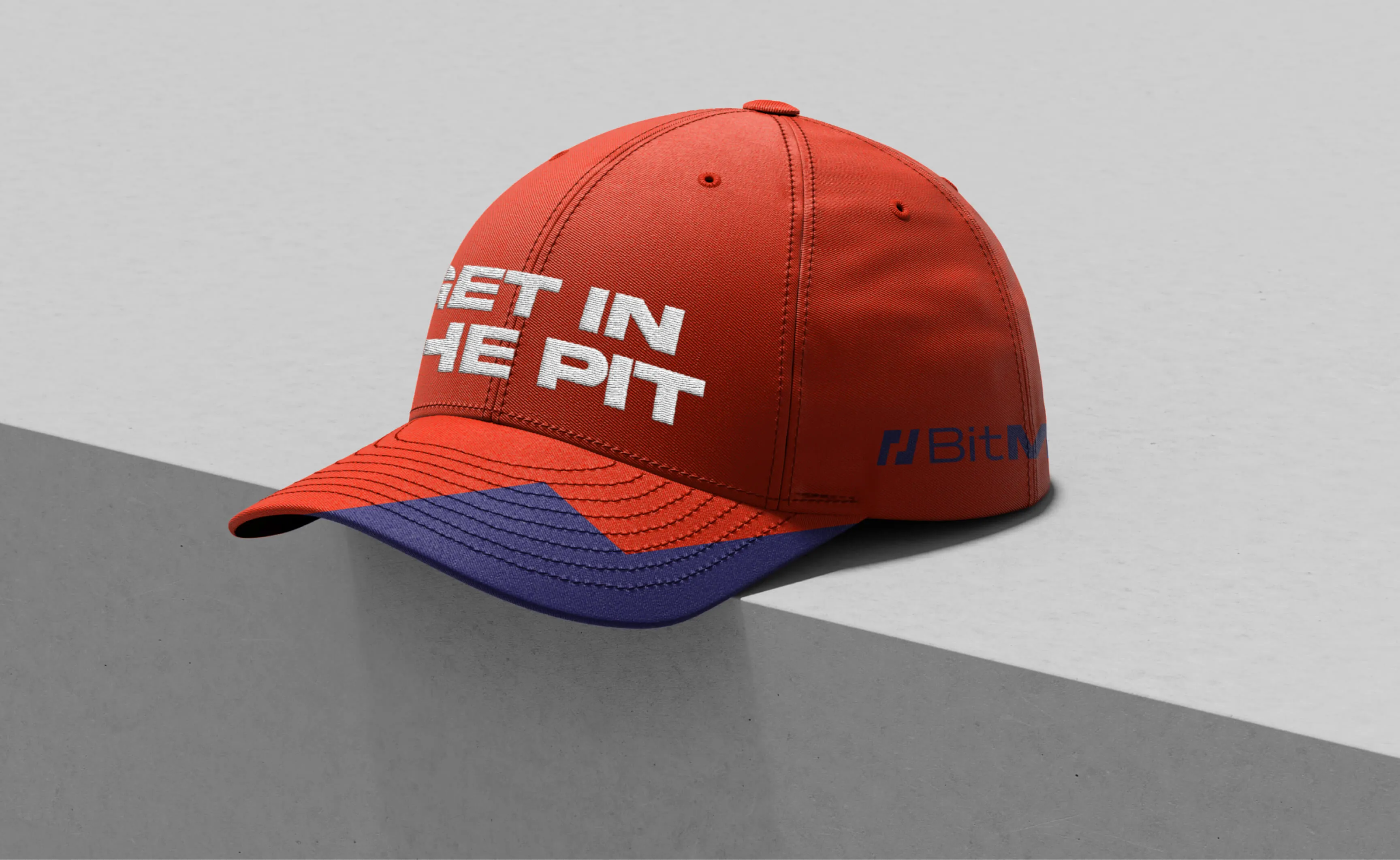
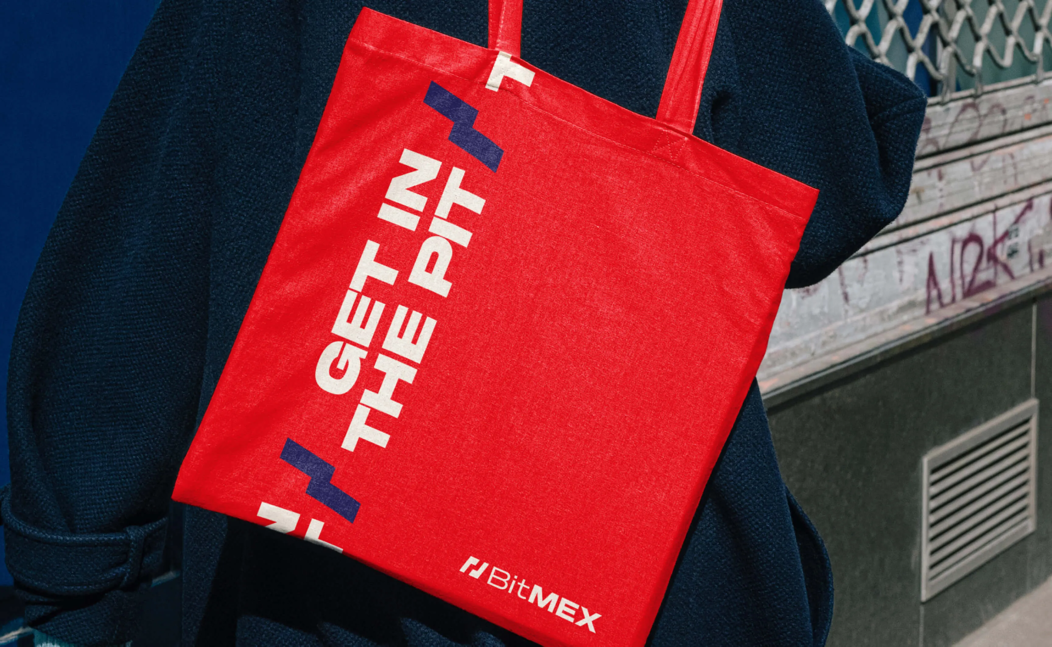
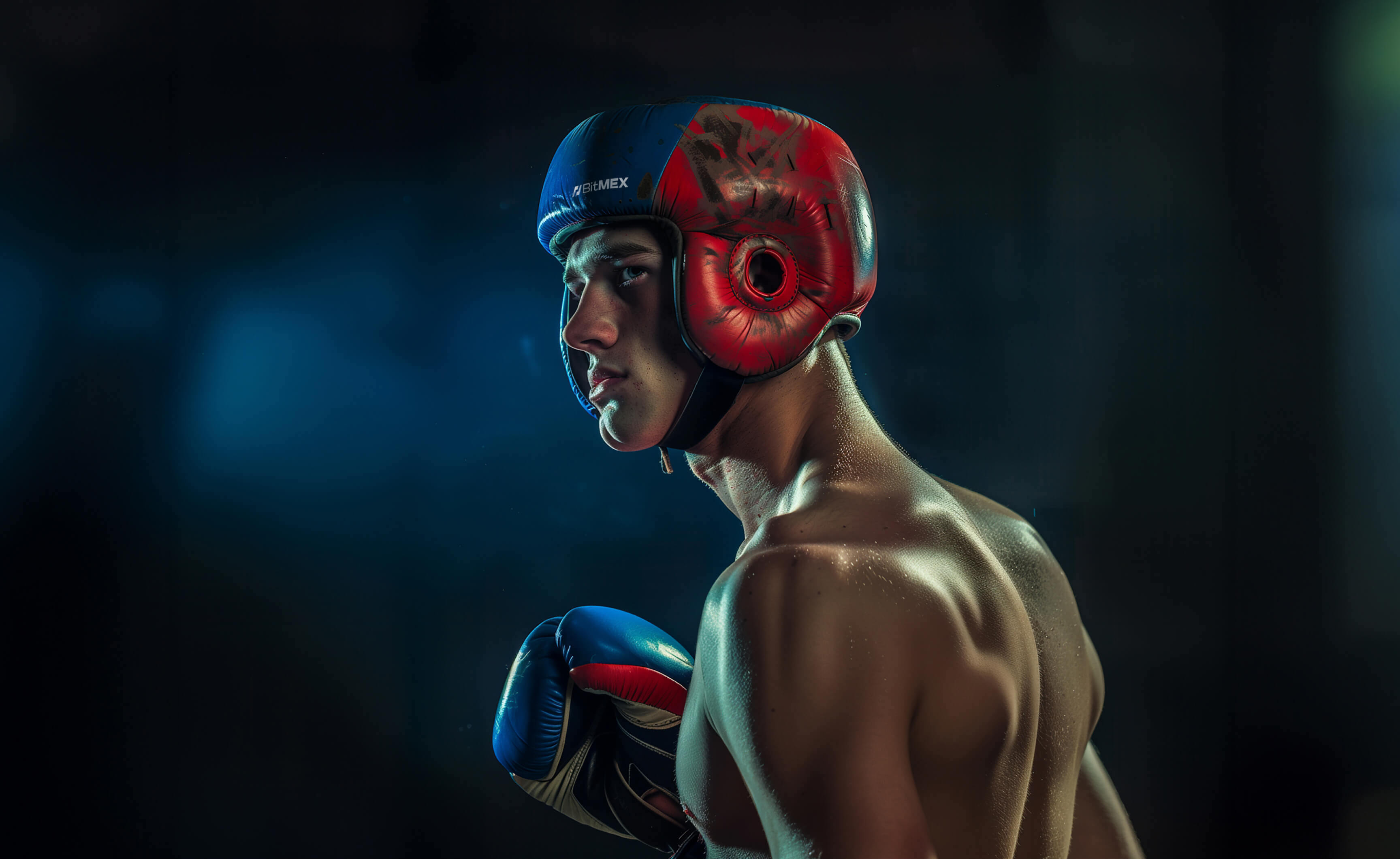
We positioned ourselves as a fair but hard exchange, akin to a boxing pit: everyone can get in, but it takes skills to come up on top.
“Get in the pit”
Outcomes and Aesthetic Choices
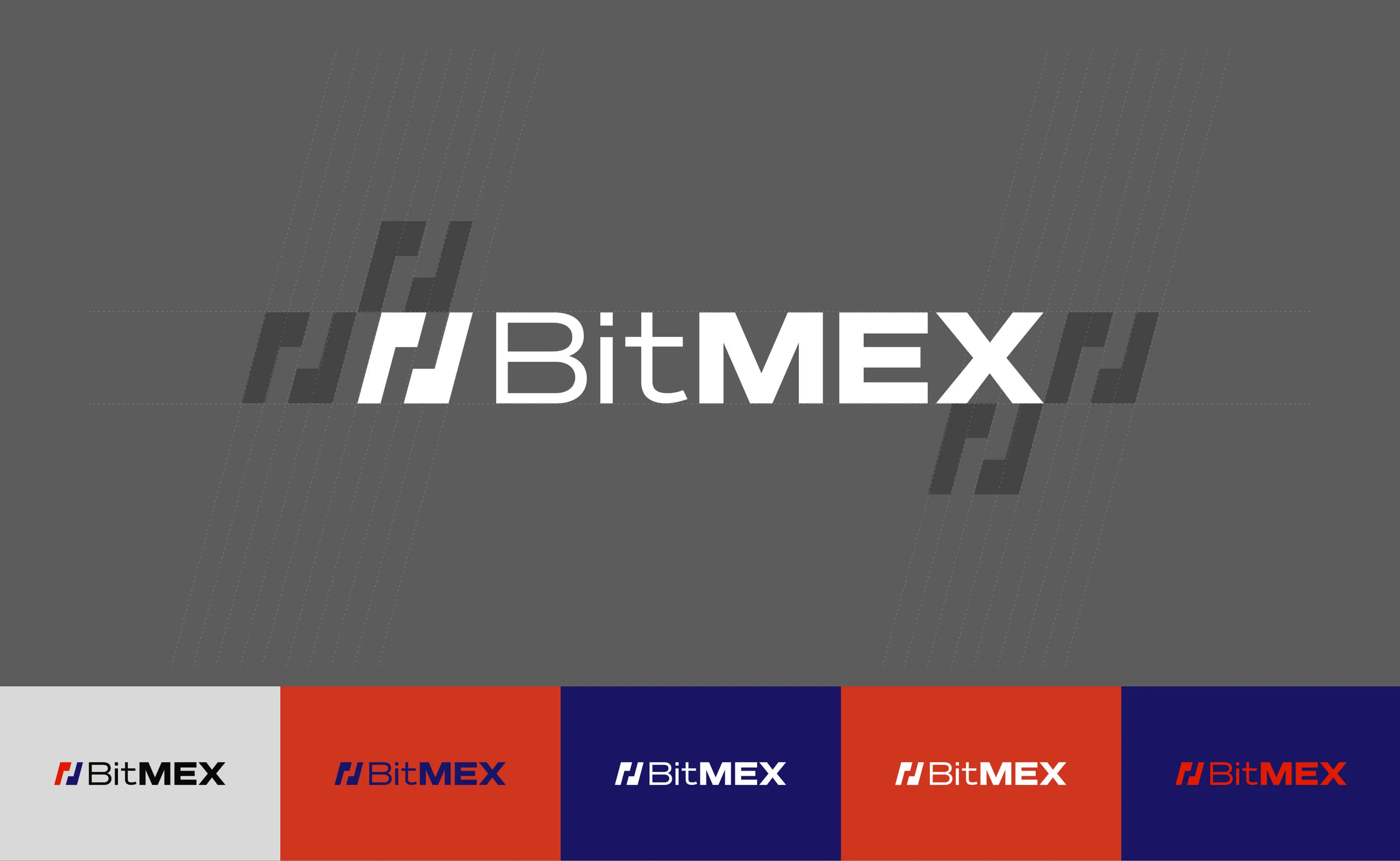
Color Scheme
- Red: Became more vivid, giving a more energetic and aggressive feel.
- Blue: Transitioned to a darker, royal tone for a serious and authoritative look.
Typography
- Fonts: Akira expanded, inspired by martial arts and vintage posters, combined with the clean and modern Helvetica Neue for balance.
Imagery
- The visual concept used martial arts as a metaphor for trading.
Texture
- The overall aesthetic included a light texture, evoking folded paper, in line with a vintage poster style.